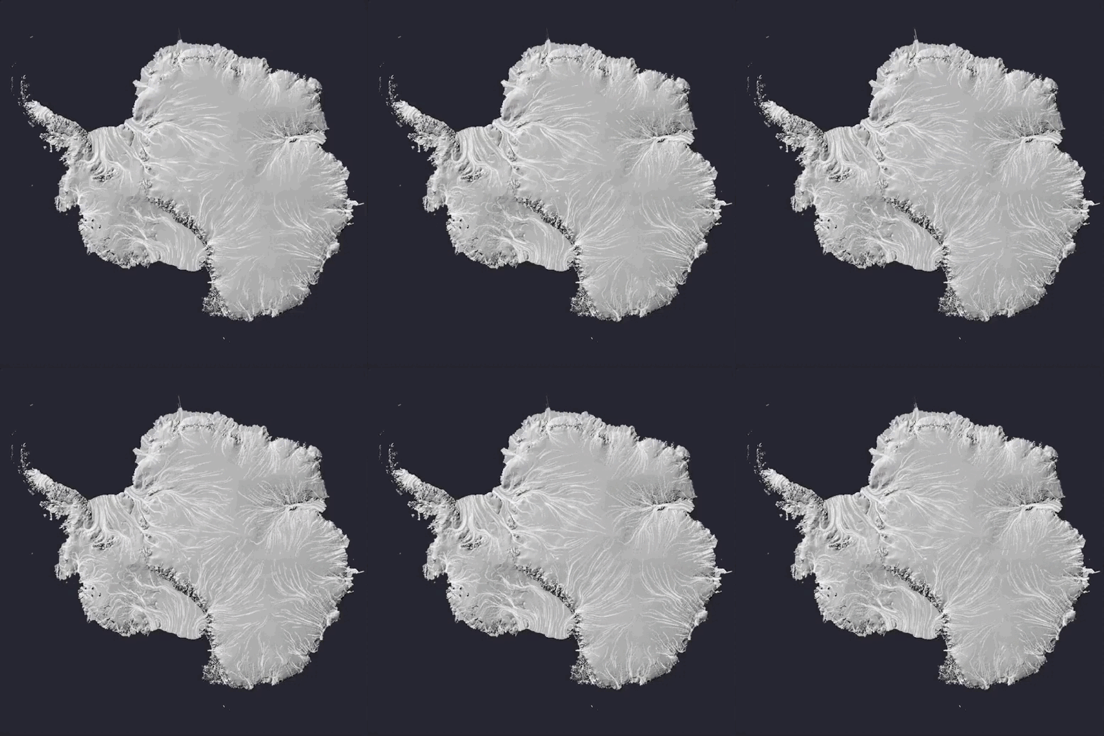
Ice flow in Antarctica
Data Visualization
Illustration with a particle flow.
Data visualization is great medium to communicate science to a large audience. The exercise has however numerous traps. As a scientist, we start with the assumption that the audience has a given scientific background. This assumption is hard to evaluate and may lead to misinterpretation. Here is an attempt to illustrate the flow of ice in Antarctica. Like lava or water, ice is flowing. It just flows on a (very) long time scale. This visualization is based on the Jérémie Mouginot et al. dataset published in Geophysical Research Letters.
